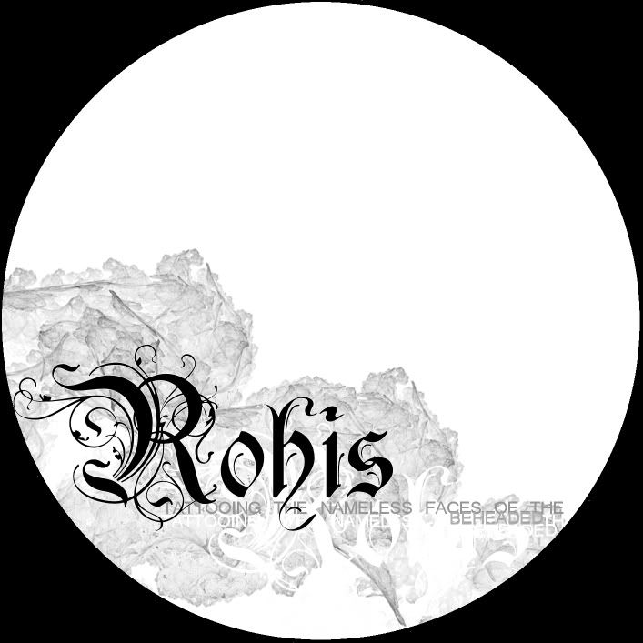
the original photo was a micropscope view that I used a kelidascope effect on. And I'm not sure I agree that it's numetal sounding. I haven't heard of any numetal albums with a similar name.
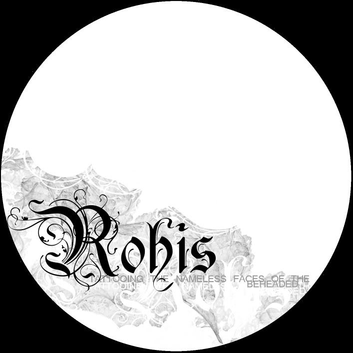
i honestly would like it better if it were more minimal, specifically by losing the circle and having it all white. the simplistic hard edge distracts from the intricacies (sp..) of the image.
post by wade nli at Feb 24,2006 7:25pm
hah..nevermind. i should never, EVER post on a friday night.
is that supposed to be a moon or something? and i don't really like the tittle, but that really has nothing to do with the artwork, i think it's cool looking, any of the 3 really
post by Niccolai NLI at Feb 24,2006 8:36pm
it's the thermal graphic thats being put on the actual disk itself, hence it being a circle.
Yea, the font is used alot. It's temporary until Mark Fucking Richards finishes our logo.